vh to rem
A converter that calculates the rem from a vh for given rem size and viewport height to make the measurement responsive
Hot Keys
Calculate and copy the result of calculation.
Calculate the result.
Copy the result of calculation.
Reverse the converter to "REM to VH".
Focus the "Viewport Height" input.
Focus the "VH Unit" input.
Focus the "REM Size" input.
FAQ
How to convert VH to REM?
To convert vh to rem, you should know total size of 1 REM, default is 16px, and size of viewport height Then, just apply formula: ((vh * viewport total height) / 100) / rem size For example, with 16px size of 1rem and 1000px of viewport height, 5vh will be converted to: ((5 * 1000) / 100) / 16 = 3.125rem
What is the VH to REM formula?
((vh * viewport total height) / 100) / rem size
What is rem unit?
REM is defined relative to the font size of the root element. The root element is matched by the :root pseudo-class or the html selector. 1 REM therefore takes on the value which is given to the font-size of the root element. This means that 1 REM keeps the same value throughout your whole CSS code.
What is vh unit? (Viewport Height)
Used in responsive design, Viewport Height (VH) is a unit relative to web page display area called viewport. 1vh corresponds to 1% of display. So, to make an element full height, you should use 100vh. You can also use decimal values. Please note that, depending on browsers, decimal precision can change.
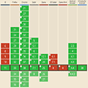
VH to REM Conversion Table if viewport height size is 1080px and rem size is 16px
| vh | rem |
|---|---|
| 1vh | 0.675rem |
| 2vh | 1.35rem |
| 3vh | 2.025rem |
| 4vh | 2.7rem |
| 5vh | 3.375rem |
| 6vh | 4.05rem |
| 7vh | 4.725rem |
| 8vh | 5.4rem |
| 9vh | 6.075rem |
| 10vh | 6.75rem |
| 11vh | 7.425rem |
| 12vh | 8.1rem |
| 13vh | 8.775rem |
| 14vh | 9.45rem |
| 15vh | 10.125rem |
| 16vh | 10.8rem |
| 17vh | 11.475rem |
| 18vh | 12.15rem |
| 19vh | 12.825rem |
| 20vh | 13.5rem |
| 21vh | 14.175rem |
| 22vh | 14.85rem |
| 23vh | 15.525rem |
| 24vh | 16.2rem |
| 25vh | 16.875rem |